Free Download
Recent Posts




Converting website visitors into actual leads is a core challenge for almost every business online. Essentially, it boils down to making it as easy and compelling as possible for someone who lands on your site to take the next step – whatever that step may be for your service or product. Think of it less as a complex sales technique and more about offering clear pathways and irresistible reasons for engagement. This article will delve into practical strategies you can implement to achieve just that.
Before you even think about forms or call-to-actions, you need a solid grasp of who you’re trying to reach. Without this, you’re essentially shouting into the void and hoping someone picks up your message. Effective lead conversion starts with empathy and insight.
Who Are You Talking To?
Developing detailed buyer personas isn’t just a marketing buzzword; it’s a crucial exercise. These aren’t just demographics; they’re semi-fictional representations of your ideal customers based on market research and real data about your existing customers. Consider their:
- Demographics: Age, location, income, job title.
- Psychographics: Hopes, fears, motivations, values, interests. What keeps them up at night? What are their aspirations?
- Pain Points: What problems do they currently face that your product or service can solve? Be specific.
- Goals: What do they aim to achieve? How does your offering align with these goals?
- Online Behavior: Where do they spend their time online? What websites do they visit? How do they prefer to consume information (text, video, audio)?
Mapping the Buyer’s Journey
Once you know who you’re talking to, you need to understand where they are in their decision-making process. The buyer’s journey typically has three stages:
- Awareness: The prospect realizes they have a problem or need. They’re looking for information, but not necessarily a solution yet. Content might be blog posts, research guides, infographics.
- Consideration: The prospect has defined their problem and is now researching potential solutions. They’re evaluating different approaches, products, or services. Content here could be comparison guides, expert interviews, webinars.
- Decision: The prospect is ready to make a purchase or commit to a solution. They’re looking for specific product details, demos, testimonials, and pricing.
Tailoring your conversion offers to the appropriate stage is vital. Asking for a “demo” from someone in the awareness stage is like asking for marriage on a first date – typically too soon.
To effectively convert visitors to leads, understanding the role of user experience and interface design is crucial. A related article that delves into this topic is titled “How User Experience and Interface Design Drive Website Engagement.” This piece explores how an optimized design can enhance user interaction and ultimately lead to higher conversion rates. For more insights, you can read the article here: How User Experience and Interface Design Drive Website Engagement.
Optimizing Your Website: The Digital Storefront
Your website isn’t just an online brochure; it’s a dynamic tool designed to guide visitors towards conversion. Every element, from navigation to page load speed, plays a role.
Clear and Intuitive Navigation
If visitors can’t find what they’re looking for quickly, they’ll leave. Your website’s navigation should be:
- Simple: Avoid overly complex menus or too many options.
- Logical: Group related items together. Use common naming conventions.
- Consistent: Navigation should appear in the same place and style across all pages.
- Mobile-Friendly: A large percentage of users access websites via mobile. Ensure your navigation works seamlessly on smaller screens.
Think about a new visitor. Can they understand what you offer and where to go next within a few seconds?
Compelling Content and Messaging
The words and visuals on your site are your sales team. They need to be clear, concise, and persuasive.
- Headline Hooks: Your headlines are often the first thing people read. They should grab attention and clearly state the value proposition.
- Benefit-Oriented Copy: Instead of just listing features, explain how those features benefit the user. Focus on solving their problems and improving their situation.
- Visual Appeal: Use high-quality images and videos that support your message. Break up long blocks of text with visuals, bullet points, and subheadings.
- Trust Signals: Include testimonials, case studies, awards, security badges, and partner logos. These build credibility and reduce friction.
Don’t use jargon unless your audience specifically understands it. Speak their language.
Streamlined Page Experience
A clunky, slow, or confusing page will hemorrhage potential leads.
- Page Load Speed: Slow-loading pages are a guaranteed conversion killer. Optimize images, leverage caching, and minimize unnecessary scripts. Visitors expect pages to load almost instantly.
- Mobile Responsiveness: Your site must adapt flawlessly to any screen size. Test it on various devices.
- Readability: Use appropriate font sizes, line spacing, and contrast. Break up long paragraphs.
- Eliminate Distractions: Keep pages focused on their primary goal. Avoid pop-ups that appear too soon or are difficult to close.
Think about the user’s flow. Are there any unnecessary steps or roadblocks?
Crafting Irresistible Offers: The Value Exchange

A lead magnet is a valuable piece of content or a service that you offer to prospects in exchange for their contact information. It’s not just a sign-up form; it’s a promise of value.
Free, But High-Value Content
Your lead magnet needs to significantly help or inform the prospect. It should solve a small, specific problem or provide critical information related to your broader offering. Examples include:
- E-books/Guides: In-depth resources on a relevant topic.
- Templates/Checklists: Practical tools that streamline a process for them.
- Webinars/Workshops: Live or recorded sessions offering expert insights.
- Free Trials/Demos: A chance to experience your product or service firsthand.
- Exclusive Content: Access to articles, videos, or tools not available elsewhere.
- Consultations/Assessments: A personalized review of their situation.
Ensure the value is immediately apparent and directly addresses a pain point identified in your buyer persona research.
Clear Call-to-Actions (CTAs)
Your CTAs are the signposts guiding visitors to your offers. They need to be:
- Prominent: Easily visible and stand out from the rest of the page. Use contrasting colors, strategic placement, and ample white space.
- Action-Oriented: Use strong verbs that compel action (e.g., “Download Now,” “Get Your Free Guide,” “Start Your Trial,” “Request a Demo”).
- Benefit-Driven: Briefly state what the user will gain by clicking (e.g., “Download Your Guide to Banish SEO Headaches”).
- Concise: Keep them short and to the point.
- Above the Fold (Ideally): Especially for primary CTAs on landing pages, ensure they’re visible without scrolling.
Don’t make people hunt for what you want them to do.
Testing and Iteration for Optimal Performance
Even the most well-designed offers can be improved. A/B testing is your secret weapon.
- Headline Variations: Test different headlines for your lead magnet or landing page.
- CTA Text and Color: Experiment with different wording, button colors, and sizes.
- Form Length: Shorter forms often convert better, but longer forms can qualify leads more effectively. Test the optimal balance for your goal.
- Landing Page Layout: Try different arrangements of content, images, and CTAs.
- Offer Type: Sometimes, a different type of lead magnet altogether might perform better.
Continuously test and analyze your results. Small improvements can lead to significant gains over time. Don’t be afraid to fail; learn from it and try again.
Streamlining the Lead Capture Process: Reducing Friction
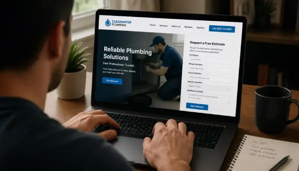
Once someone decides to engage, the last thing you want is a clunky, frustrating process. Your lead capture forms and pages need to be smooth and intuitive.
Designing Effective Forms
Forms are often the final hurdle in lead conversion. Make them as quick and painless as possible:
- Keep it Short: Only ask for essential information. Each additional field reduces conversion rates. Can you get by with just an email address and name initially?
- Logical Flow: Group related fields together.
- Clear Labels: Use descriptive and clear labels for each field.
- Error Messaging: Provide helpful, specific, and friendly error messages if a field is filled incorrectly.
- Progress Indicators: For longer forms, a “step 1 of 3” bar can reduce perceived effort.
- Privacy Assurance: Include a brief statement about how you’ll use their data (e.g., “We respect your privacy. No spam, ever.”).
Remember, you’re asking for trust. Don’t betray it with a cumbersome form.
Dedicated Landing Pages
Don’t send people interested in a specific offer to your general homepage. Use dedicated landing pages that are:
- Focused: Eliminate all distractions (like navigation menus to other parts of your site) not relevant to the specific offer. The sole purpose of a landing page is conversion for that offer.
- Consistent: The messaging and visuals on the landing page should match the ad or link that brought the visitor there.
- Benefit-Oriented: Reiterate the value proposition of the offer clearly and concisely.
- Include Social Proof: Testimonials, reviews, or security seals relevant to the offer.
- Clear CTA: A prominent call to action, as discussed earlier.
A good landing page acts like a laser-focused salesperson, guiding the visitor towards a single action.
Post-Conversion Experience
What happens immediately after someone fills out your form? This experience is critical for reinforcing trust and guiding them to the next step.
- Thank You Page: Immediately redirect them to a thank you page.
- Confirm their submission.
- Explain what happens next (e.g., “Check your inbox for the guide!”).
- Provide immediate access to the offer if applicable (e.g., direct download link).
- Suggest a next simple step (e.g., “Follow us on social media,” “Explore related content,” “Watch this short video”).
- Confirmation Email: Send an automated email confirming their subscription or download. This also serves as a way to deliver the lead magnet again and initiate further communication.
- Timely Follow-Up: If it’s a demo request or a consultation, ensure your team follows up promptly, ideally within minutes or hours, not days.
A smooth post-conversion experience reinforces that they’ve made a good decision and sets the stage for future engagement.
In the quest to enhance online presence and effectively convert visitors to leads, businesses can benefit from exploring various strategies and case studies. A great example of this is the project portfolio of Sweet Delight Cakery, which showcases how a well-designed website can attract and engage customers. You can read more about their approach and the impact of effective web design on lead generation in this insightful article here. By understanding the elements that contribute to a successful conversion strategy, companies can better tailor their online efforts to meet customer needs.
Nurturing Leads: Building Relationships (Beyond the Click)
| Month | Visitors | Leads Generated | Conversion Rate |
|---|---|---|---|
| January | 5000 | 250 | 5% |
| February | 6000 | 300 | 5% |
| March | 7000 | 350 | 5% |
Getting contact information is just the first step. True lead conversion involves nurturing that relationship until they’re ready to become a paying customer. This takes consistent effort and value delivery.
Automated Email Sequences
Once you have their email, an automated email sequence can gently guide them further down the funnel. These aren’t sales pitches immediately; they’re about providing more value.
- Welcome Email: Thank them, reiterate the value, and potentially deliver the lead magnet again.
- Educational Series: Provide additional tips, resources, or insights related to their original interest.
- Problem/Solution Focus: Highlight common pain points and explain how your solution addresses them, without overtly selling.
- Use Cases/Case Studies: Share stories of how others benefited from your product or service.
- Soft CTAs: Intermittently include calls to action for deeper engagement (e.g., “Read our latest blog post,” “Watch a quick demo,” “Schedule a free consultation”).
Personalize these emails where possible. Segment your audience so they receive relevant messages based on their initial engagement or interests.
Retargeting Campaigns
Not everyone converts on their first visit, or even after receiving your lead magnet. Retargeting (or remarketing) allows you to re-engage these visitors.
- Cookie-Based Tracking: Place a pixel on your website to track visitors.
- Targeted Ads: Show relevant ads to these visitors on platforms like Google, Facebook, Instagram, or LinkedIn.
- Refined Messaging: Tailor the ad creative and messaging to what they viewed on your site or the lead magnet they downloaded. For example, if they downloaded SEO tips, show them an ad for your SEO service.
- Offer Variety: Present different offers to break through initial resistance. Maybe offer a discount or a free trial if they didn’t convert on the first attempt.
Retargeting keeps your brand top-of-mind and provides additional opportunities for conversion.
Leveraging Different Channels
Lead nurturing isn’t confined to email. Consider other channels where your audience spends their time:
- Social Media: Share valuable content, engage in conversations, and re-post your lead magnets on platforms where your personas are active.
- Content Marketing: Continue to publish blog posts, videos, podcasts, and infographics that address their ongoing needs and questions.
- Direct Outreach (for higher-value leads): For B2B or high-value B2C leads, a personalized phone call or LinkedIn message from a sales representative can be highly effective. This requires careful timing and a non-salesly approach initially.
The goal is to consistently deliver value and gently guide prospects towards making an informed decision, building trust and authority along the way. Lead conversion isn’t a one-and-done event; it’s a journey.